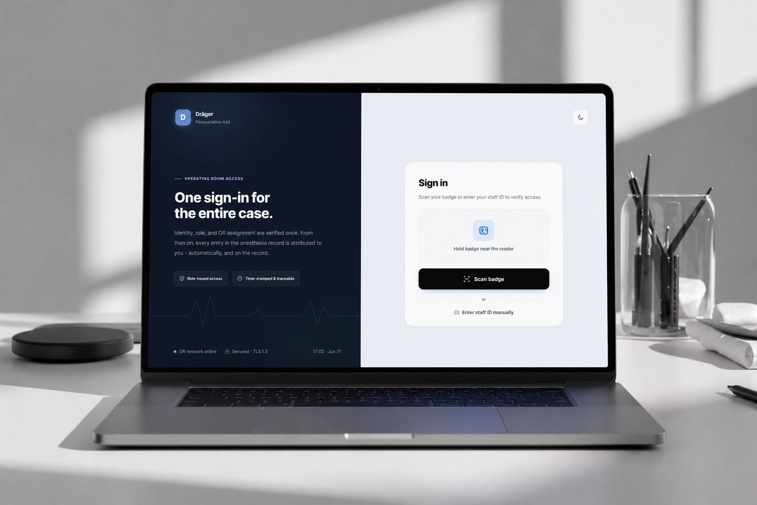
The chart is a live decision aid and a medico-legal document at once.
A perioperative anesthesia charting system for a global medical-device manufacturer, spanning pre-op assessment, intra-operative monitoring, and post-op reporting. It integrates with hospital infrastructure and live monitoring devices to support real-time vitals, medication and fluid management, and clinical documentation.
It's a safety-critical, regulated system. I focused on the intra-operative phase, where the stakes and the interaction pressure are both at their highest.
Three insights reframed this from a UI cleanup into a primitive problem.
Documentation isn't a task that follows the action. It is the action.
The product assumed clinicians act, then record. But under anesthesia, recording a drug is part of administering it safely. Treating documentation as a downstream step put it in direct competition with the patient for the clinician's attention, a competition the patient should always win.
The cost isn't slowness. It's the divergence between event and record.
When logging is interruptive, clinicians defer it, and deferred logging becomes reconstruction from memory. Timings blur, sequence drifts. For a document that drives handover and stands up in medico-legal review, the failure mode isn't "slow," it's "inaccurate in ways no one notices until it matters."
The interface modeled the wrong primitive.
The system's primitive was the form, a bounded unit you open, complete, and close. But clinical reality is a continuous, time-ordered stream of interdependent events. Every other problem descended from this one mismatch. So the redesign wasn't "improve the forms." It was "change the primitive."
A clinician's mental model is temporal, not spatial.
They don't think "which screen holds the drug field." They think "at 10:42 I gave 50mg, the BP dropped, I responded." The legacy IA forced them to translate a time-based reality into a screen-based structure, and that translation tax was paid in the most cognitively loaded moments of the day. So I set the goal as making the interface model match the mental model: time-first, not screen-first.
Who I designed for
Mid-procedure clinician
Anesthesiologist or nurse anesthetist. Hands often gloved or occupied; attention split across patient, monitors, and surgical field. Interaction windows are seconds, frequently one-handed. Closer to a cockpit than a desk.
Handover & post-op
The same clinician, now reading rather than writing, needing to reconstruct the case quickly and trust it.
Audit & medico-legal
Reviewers who need completeness and defensible accuracy above all.
The dominant constraint, seconds of split, possibly one-handed attention, is what made conventional "good UI" instincts wrong here.
Jobs to be done
When I administer something mid-procedure, I need to record it in one or two glances, so the record stays true without costing me the moment.
When the situation changes rapidly, I need true timing and sequence preserved automatically, so the chart reflects reality, not my later memory of it.
When I hand over or get audited, I need to read the case as a sequence of decisions, so I can reason about what happened, not reassemble it.
From parallel forms to a single time-anchored stream.
This is the load-bearing decision. Every event type resolves to one primitive, a timestamped entry on a shared timeline, and the reconciliation the user used to do in their head is now done by the structure.
One continuous, time-ordered stream
Time becomes the explicit organizing axis. Everything in the UI follows from this one move.
Four load-bearing choices, all driven by the same constraint.
Inline, not modal
A modal hides the patient's live state to capture one event, backwards for this context. Inline entry keeps logging in the same visual frame as the running data.
Time as the automatic anchor
When is the most error-prone field in deferred logging, so I removed it as manual input. Entries auto-timestamp in true sequence; the clinician never reconstructs it.
Context-aware defaults
The interaction shifts from construction, deciding every field, to confirmation: verify a smart prediction. Fewer decisions on the critical path, without hiding control.
Prevention over correction
Constraints live in the input itself, dosage bounds and validation, with undo favored over confirm. The fast path and the safe path become the same path.
Five design vectors, one north star: keep attention on the patient.
Each vector balances severe technical and clinical constraints against the same goal: the clinician's eyes stay on the patient, not the chart.
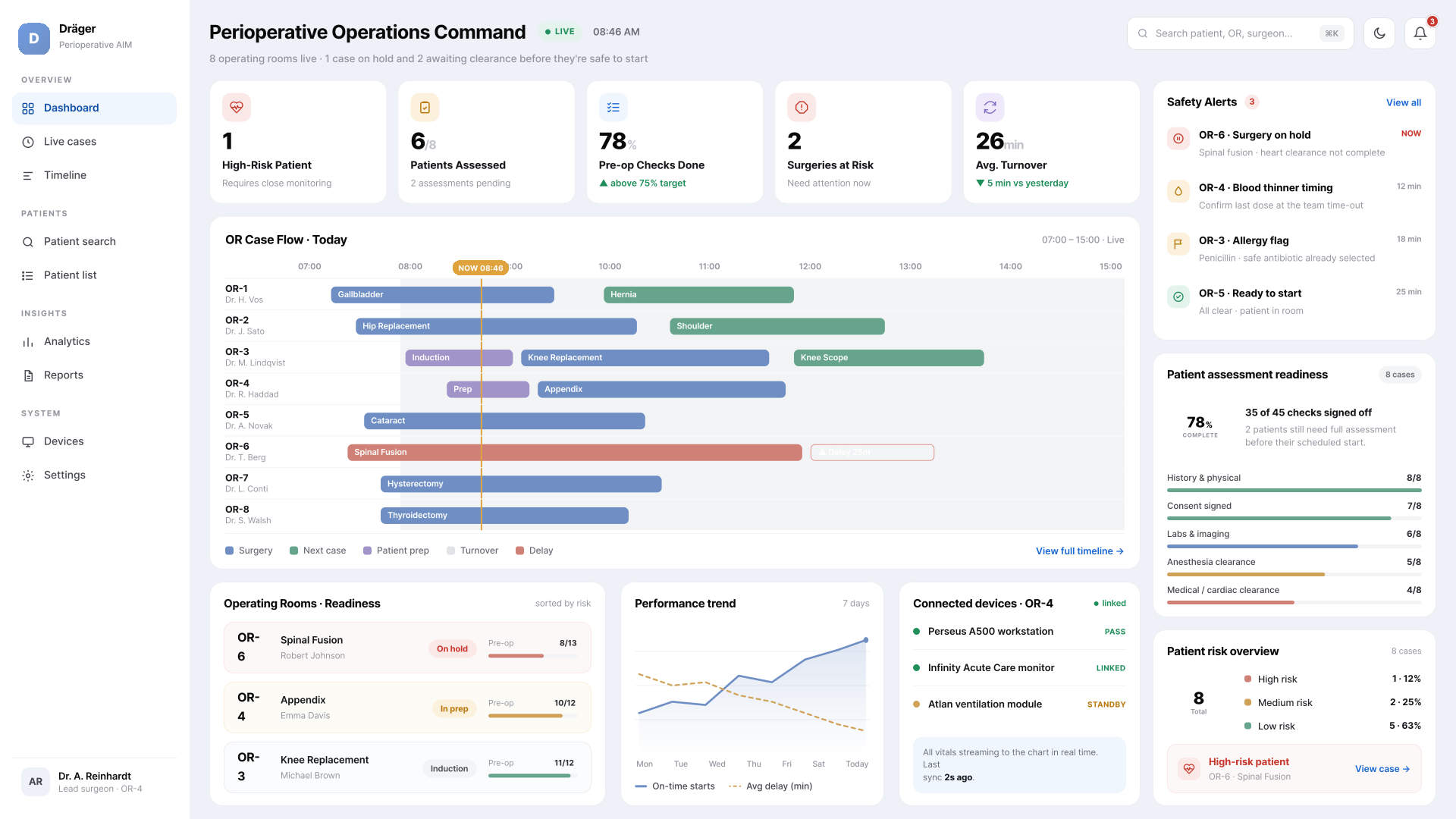
OR Command Center
A high-density board tracking every active OR suite. Color carries meaning, not decoration: red / yellow / green is reserved exclusively for case-delay and patient-safety thresholds, so the channel that signals risk never competes with cosmetic color.
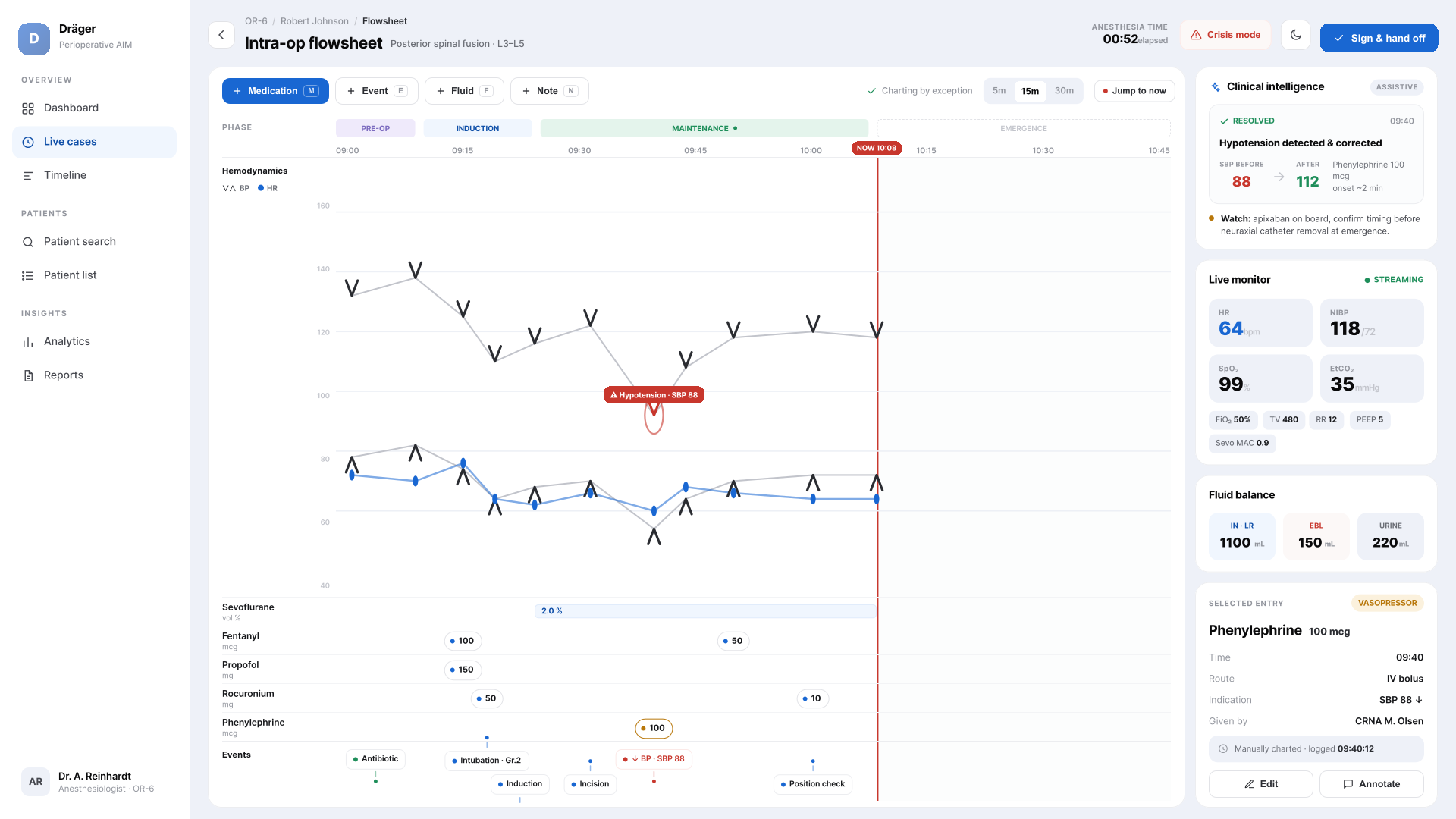
The Fluid Flowsheet Timeline
A high-performance timeline with infinite pan / zoom to the minute. Vitals sample dynamically to stay legible at any zoom while preserving full raw mathematical integrity underneath: a clean trend on the surface, the true data intact below.
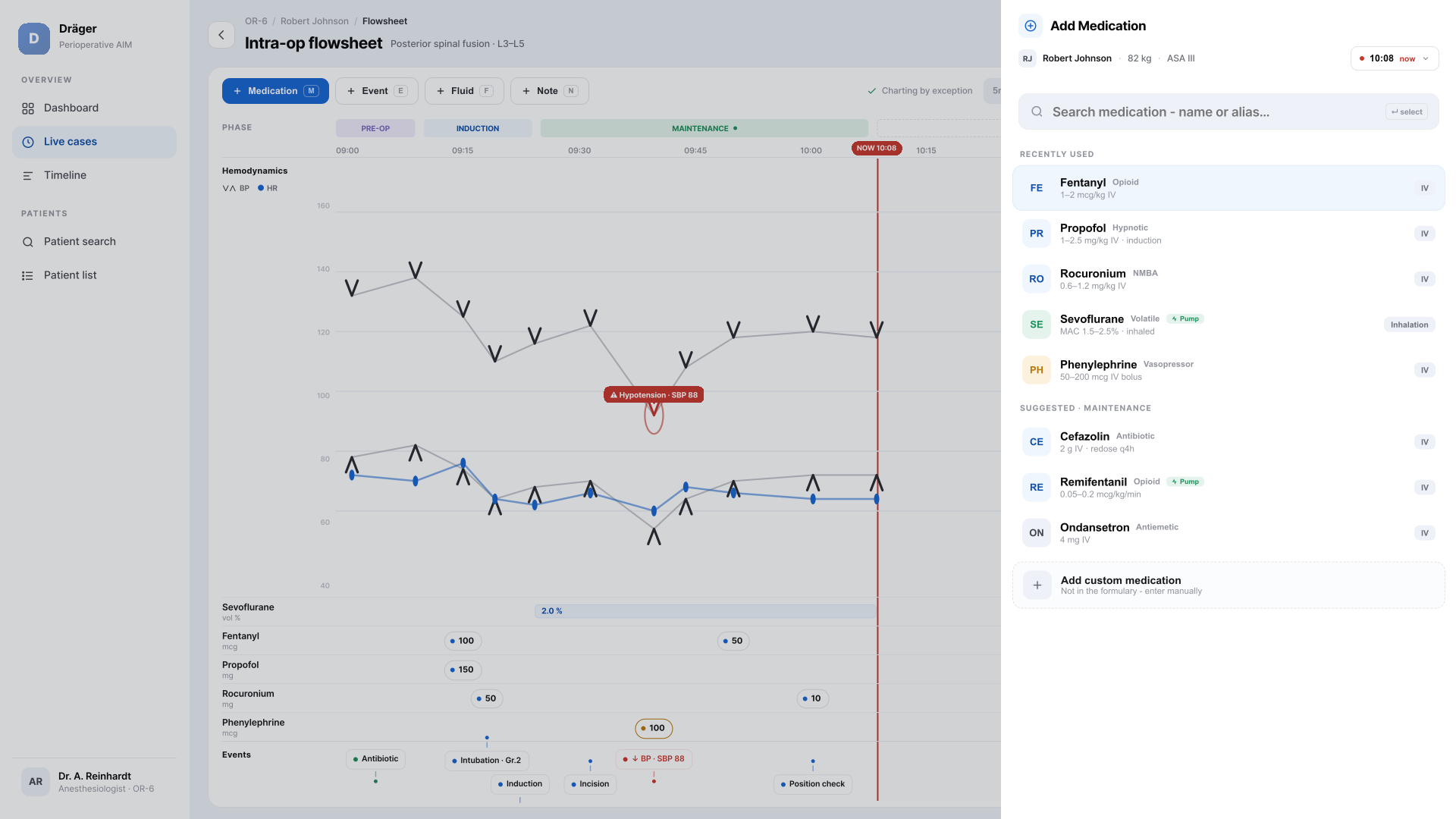
Context-aware side-sheets
Adding a med or event opens a non-modal side-sheet; the flowsheet shifts slightly but stays fully visible. The clinician logs without ever losing sight of the patient's live status.
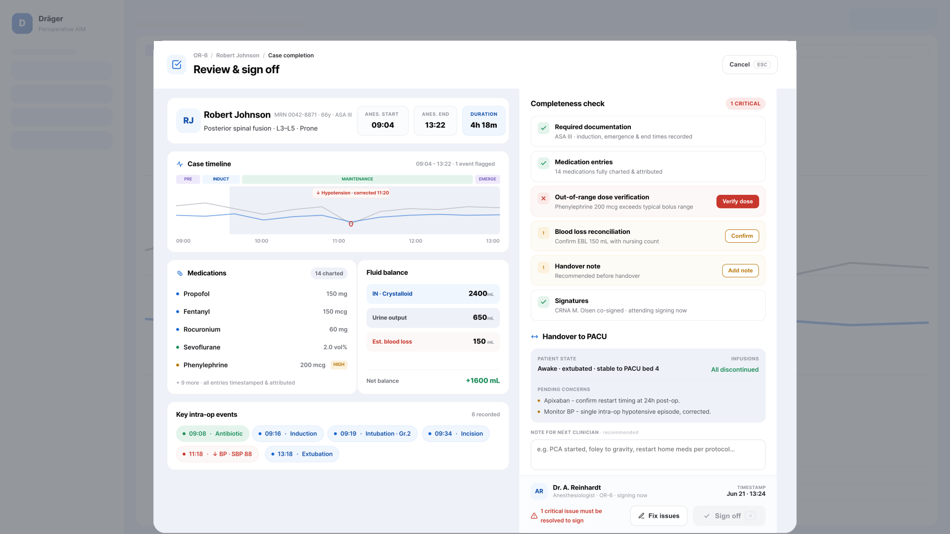
Gated handoff & compliance
A hard programmatic checklist verifies mandatory regulatory data, consents and time-outs, before a digital signature is enabled. Compliance moves from something you remember to something the system enforces.
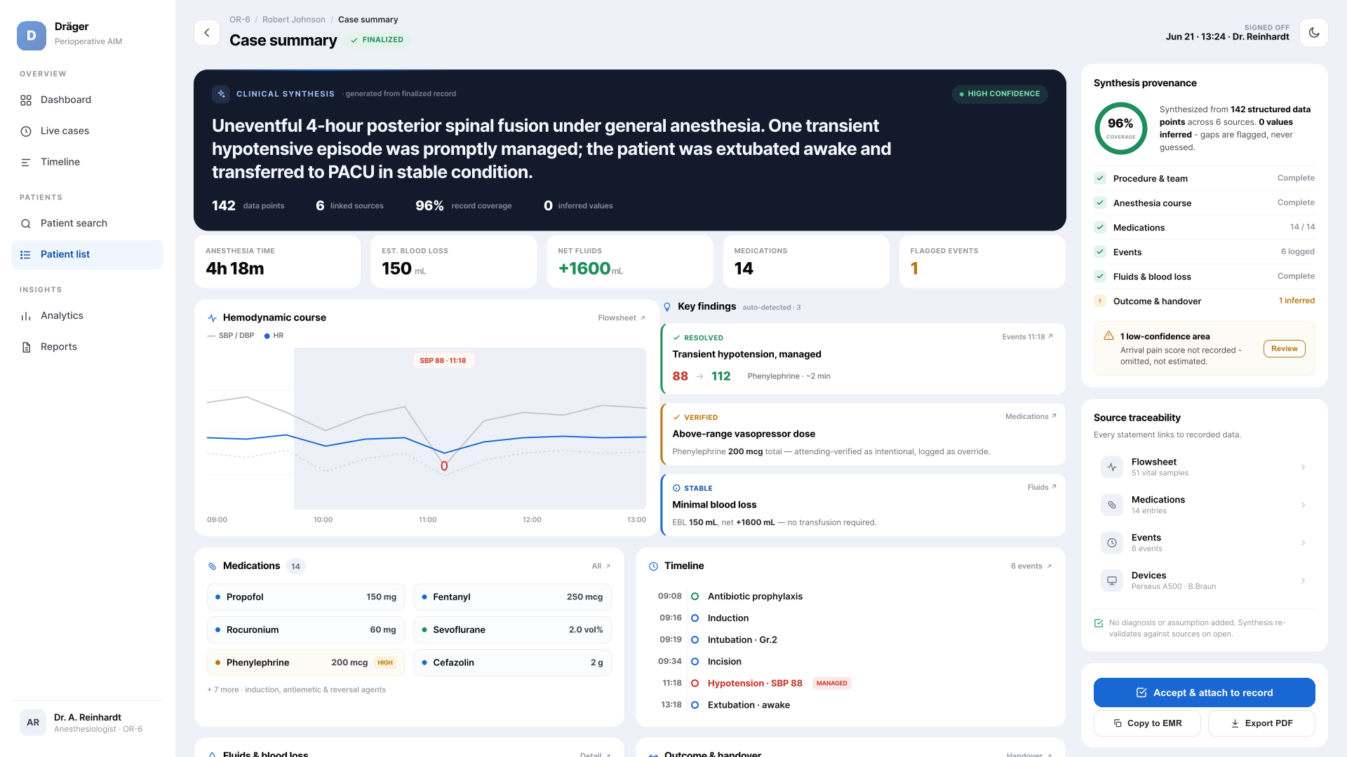
AI-assisted documentation sidebar
An opt-in, non-deterministic sidebar that reads structured timeline parameters to draft real-time narrative progress notes. Assistive by design: it accelerates the clinician's writing; it never authors or signs the record.
Where I chose deliberately, and why.
The same temporal model, carried beyond the chart.
Once the timeline primitive held inside the operating room, the harder test was whether it scaled to the surfaces around it, pre-operative readiness and floor-wide coordination. Two of those explorations.
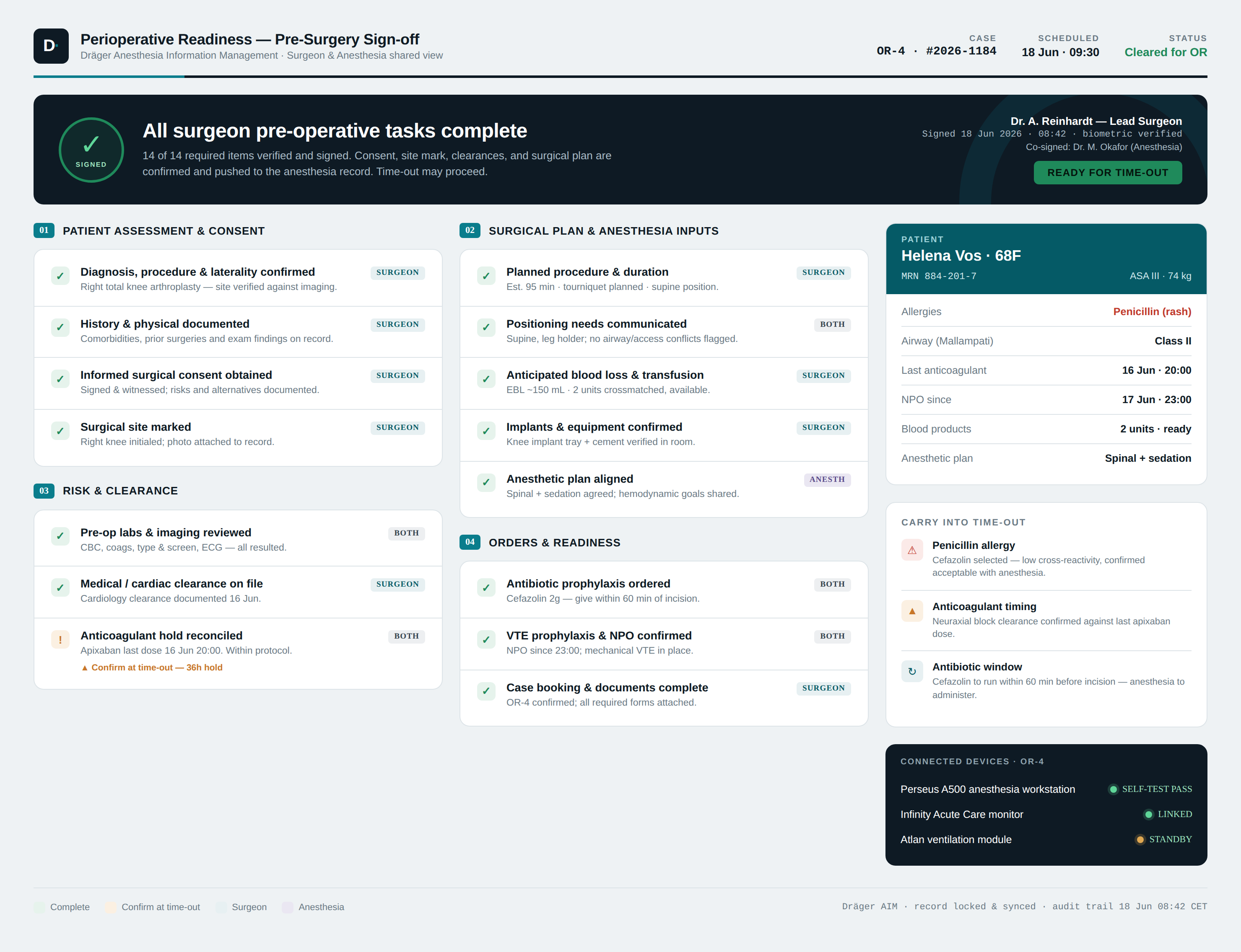
Pre-surgery sign-off, as a shared readiness state
A single surgeon-and-anesthesia view that resolves every pre-operative task into one signed, time-stamped readiness state, so the team enters time-out knowing exactly what is, and isn't, cleared.
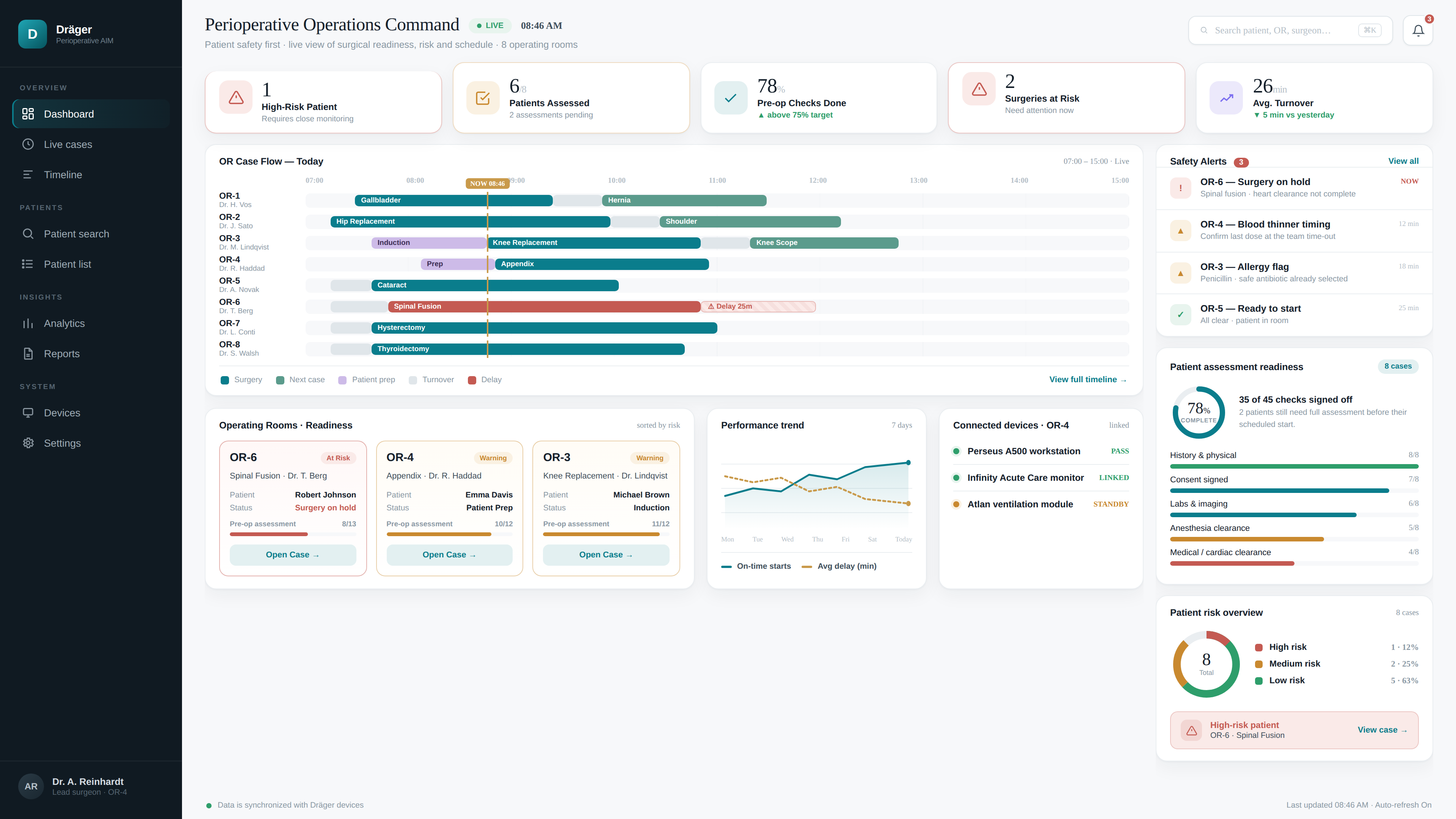
Floor-level command, anchored to the same timeline
Scaling the model from one case to a whole surgical floor: live OR case flow, assessment readiness and patient risk surfaced against the day's timeline, with safety ahead of schedule.
Grounded in workflow ergonomics, measured in enterprise outcomes.
Most enterprise software optimizes for the user who has time, and quietly fails the user who doesn't.
When the context collapses to seconds of divided attention, the usual virtues (whitespace, minimalism, completeness) can become liabilities. The right design is the one that disappears into the flow of action rather than asking the user to attend to it.
The deeper move wasn't visual. It was changing the system's primitive, from form to moment, and letting the entire interface follow from matching the tool to how people think under pressure.
to decision timelines.